Business Intelligence

Ostendo comes with more than 400 standard reports, analysis views and inquiry screens. It also comes with an advanced report writer for customised business intelligence.
Customised Reports
Reports can display information in the format you require and can include graphs and graphics. Reports can be viewed on the screen, printed or emailed.
- View, print or email all reports
Analysis and Pivot Inquiry Reports
Ostendo has a number of spreadsheet or pivot-style screens that enable you to interrogate data by sorting, filtering and grouping it in various ways. These reports can include headers and footers and the ability to interactively expand and collapse detail-level data. The drag and drop control of data dimensions gives you the flexibility to explore information interactively.
- Analysis view reports like a spreadsheet with filtering, sorting and grouping
- Pivot style reports with filtering, sorting and grouping
- Charts with drill down
- View only Inquiry screens with drill down
- SQL Query writer with saved queries
- View only Inquiry screens with drill down
Queue Services
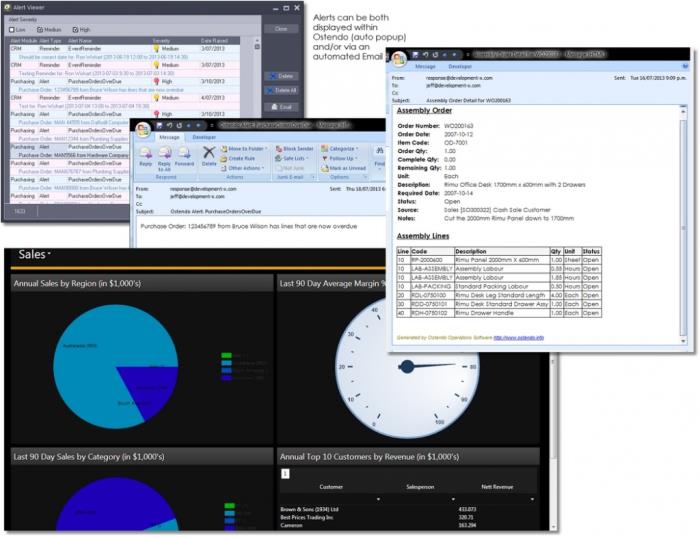
This is a service that enables our Business Intelligence solutions to run automatically at specified times or frequencies. Reports can be emailed at specified times or frequencies, or alerts can be emailed whenever business metrics fall outside of predefined parameters.
Ostendo Freeway Mobility Inquiries
- Inquiries are run in real-time.
- An Inquiry result can have a combination of a chart, scorecard (multiple KPI’s), and a listing report style.
- For Customers, there is an option of displaying balances and an aged analysis.
- For Products, there is an option of displaying a stock level listing.
- The output within Freeway can be sent to a PDF file and emailed.
- A snapshot can be taken of a portion of the inquiry display, annotate it, and record an audio note. This is much faster than typing an email.
- Scorecard KPI’s or statistics can be defined, with highlight conditional values.
- Charts (Horizontal Bar Graphs up to two series)
- Restriction counts can be defined, eg Top 10 Customers, Top 20 Selling Products.
Power BI Graphical Web KPI Dashboard
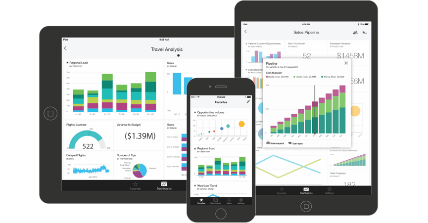
KPI dashboards present you with a graphical overview of data to give you a big picture view. This enables you to spot good or bad performance and then enables you to interactively drill down through the data to explore and analyse more detailed information. This style of analysis enables you to uncover and understand trends which may be hidden in the data. This capability is important to providing decision makers with the appropriate level of information to answer specific business questions.

